Make Your Mark @The Compound Gallery

IMG_1885

Are you afflicted with kinesthetic connection? Do you still like to write or draw with a pen or brush on paper? Do you get an oxytocin hit from feeling the feedback of the paper through your mark-making tool?

We have help for you. The only cure is to get closer to that connection. Make Your Mark gives you the means of making your own writing, drawing, painting tools. In three hours you’ll learn to make a quill pen, a reed pen and a soda-can folded pen (modified ruling pen). You’ll also get the chance to play with these tools with different paper and media – ink, gouache or watercolor.

Once you know the ancient (anything older than last year is ancient, right?) ways of making your own tools, you’ll have the means to connect even more with your work.

Make Your Mark workshop at The Compound Gallery
1167 65th st. Oakland, CA 94608
Saturday, June 18, 2016. 1:00 – 4:00 p.m.
$33 workshop + $7 materials = $40
Feathers and bamboo sticks if you want to bring them.

Custom Cards for Moto Traveler Mark Donham

I met Mark Donham in 2008, as part of an online motorcycle community called ADVrider.com. Mark lives outside of Portland and is a very accomplished rider and traveler. His wife, Chris suffered from early-onset Alzheimer’s and he quit his job to care for her in her final years. After that, he decided to take a ride around the world. The idea was to experience travel on a motorcycle after the challenge of caring for Chris. Mark documented his trip that is just wrapping up here.

Mark stayed with me on a couple of trips south and north when I lived in Penngrove at the Bank Ranch, and I stayed with him in Portland when I rode up to the Pacific Northwest in 2009. He chose to visit me on his way back to Portland after landing in LA and getting on his bike to ride home.

Mark going all analog on his social obligations

Mark going all analog on his social obligations

This morning Mark mentioned that he’d like to get some cards to send to friends that hosted him on his trip. Having just spent time in South Africa, he wanted to send thank you cards. I offered to make him a few custom ones, so we worked most of the afternoon on coming up with a few custom cards that he could send his hosts in South Africa, LA and along the way up the coast.

Original artwork for custom cards.

Original artwork for custom cards.

Mark is a very talented guy and has a good aesthetic sense, but isn’t skilled at creating visual art. So I wrote out a few versions of the simple message of Thank You and he reviewed them and then picked three.

On his trip, he would do this fun jump and set up his camera and do a self-portrait of his jumping for joy. Mark took one of those pictures, scaled it down and then used a filter on it to make it read well in black and white. He then scanned my artwork and came up  with three different cards.

Thank You - variations on a theme

Thank You – variations on a theme

It was a great way to spend the day because we talked about his trip, his future, art and what’s important about life.


IMG_2072

I’m glad I got to contribute to Mark’s trip by adding a calligraphic touch.

Mark, thanks for letting me spill a little ink on your trip!


Ruling Pen Workshop

Workshop Flyer Written WIth Ruling Pens

Workshop Flyer Written WIth Ruling Pens

How to Write with a Ruling Pen on Vimeo

Click link above for a short video

I’ll be teaching a workshop on how to use a fun calligraphy tool – the Ruling Pen. For the last 80 years, scribes have been using this “new” writing instrument to express themselves by making letters that break away from the broad edge pens of past scribes.

The pen makes its mark by being pulled and the ink is dragged out of the side of the instrument. One can vary width by what part of the instrument is being dragged across the surface – sideways. Using the pointed tip gives the scribe the chance to make small, fine letters. Working with the side of the tool, greater width strokes are possible.

Because the color is pulled out the side, there is greater inconsistency to the edge of the letterform. Add a rough-textured paper and the result is an even coarser edge. Often, splatters appear on the paper as the color is flung out when the pen is drawn across the uneven surface.

All skill levels can take this workshop. 

This workshop will teach how to use the tool, adding color and working it to greatest advantage. Students can use their own handwriting or modify calligraphic hands that they’ve learned.

The workshop is $60 for four hours of instruction and practice. The $10 fee supplies paper, ink and gouache colors to use in creating your written art. We will experiment with different papers to understand how to exploit the tool’s unique mark-making characteristics.

Ruling Pen Workshop  – Sunday, October 27, 2013
1:00  –  5:00 pm $60 +  $10 materials fee (paid at workshop)

Negative shapes

Stained C Gouache on paper

Stained C
Gouache on paper

The positive defines the negative – that is how letters work. Manipulating that relationship never gets old for me. This big ol’ C was fairly simply and directly made – a few colors painted and blended on a large sheet of paper. It got a little interesting when I sprayed water on the painted surface and let it bleed. There’s a three-dimensional quality that comes about in the staining that is far greater than on the paper itself.

A 12" square S made with acrylic paint

A 12″ square S made with acrylic paint

After talking with a few artists, I decided to move up to paint. Starting with an “open” acrylic, I gave it a try on a manufactured gessoed 12″ wooden panel. I was surprised at how easy it was to work with the color and how well it responded to watercolor technique.

B drippin'

B drippin’

And this one – where the negative becomes positive, leaving the B shape as the background. With a little staining, once again. For some reason color bleeding into the white space attracts me.

Familial diversity

Image

Letters – in the world of calligraphy and type – come in families. There should be a resemblance to the one next to it because legibility is measured by the repetition of similar patterns and shapes. When a letter doesn’t resemble one next to it, reading comprehension is lowered – it takes longer for the eye to recognize the negative shape of one letter if it isn’t in the family of its surrounding forms.

I’m not trying to make a family of letters to be put together to make words flow together, easily read.

My exercise has been to focus on each letter as if it were independent of its day job. These letters stand (mostly) alone in their finest or most outrageous garb.

Image

Maybe they’re a little skittish, or excited or they might be understated and simple.

Image

I come to the page and watch them develop in front of my eyes, like a dresser that is guided to do their bidding.

IMG_1312

IMG_1309

LETTERS: Writ Large!

Image

This coming Friday, June 7, 2013 I will be in a group show in Oakland, CA. I’m calling my part of it “LETTERS: Writ Large!”

This is the first show in which I’ve had work in a long time and I’ve been painting & lettering quite a bit in the past month. You saw the beginnings in my last post and I’ve added a number of pieces to the  pile. I’ve gotten more comfortable and confident at working large and am getting to enjoy the process. 

The show will give me a chance to see what all these letters look like spread out in a big space. 

Breaking the component parts of language back down to letters – and exploring how to paint a letter have been interesting. Getting past my internal letterform editor and allowing the letters to be and become formed as they are was tough.

Image

I found that if the shape of the letter wasn’t what I had in mind, then I presumed it was not any good. But friends that have seen them have found things in these imperfect letters that I didn’t see at first. The bowl of the P above is greater than a Trajan P would be. And I had a Trajan P in mind when I made it, so this is a failure. From that ideal.

The letter comes alive and its imperfection becomes an aspect of its personality. 

Image

Styles and techniques got thrown together and pulled apart. Using tools in ways I hadn’t used them before makes for some fun discoveries and forces a looseness that is counter to my training.

I’ve got more to say, but for now, I’ll leave you with a Tessellated T

Image

Observations On The Process Of Making Letters

15" Q ruling pen & gouache

15″ Q ruling pen & gouache

I have been suffering a 2 month long excema bout that has left me in quite a bit of pain and unwilling/able to write or do much of anything. It appears to be on the wane, so I can return to more pleasurable pursuits like writing.
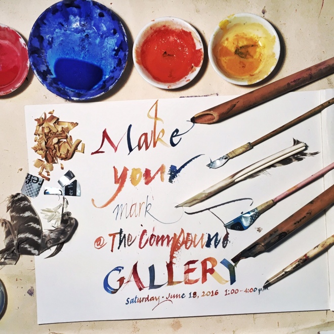
Letters, that is. 😉

Pointy A

Pointy A

I have been wanting to make a portrait letter series since the millenium – thirteen years is a long time for an idea as simple as this to come together.

At the beginning I wanted to make 26 parchment surfaces because I have made vellum and wanted to get back to it. Some people make their own paper for their art, I wanted to make my own parchment. That was the first hang-up, and a good one because it masked my fear.

And my fear was that I can’t make large letters all alone and have them look interesting.

15" O

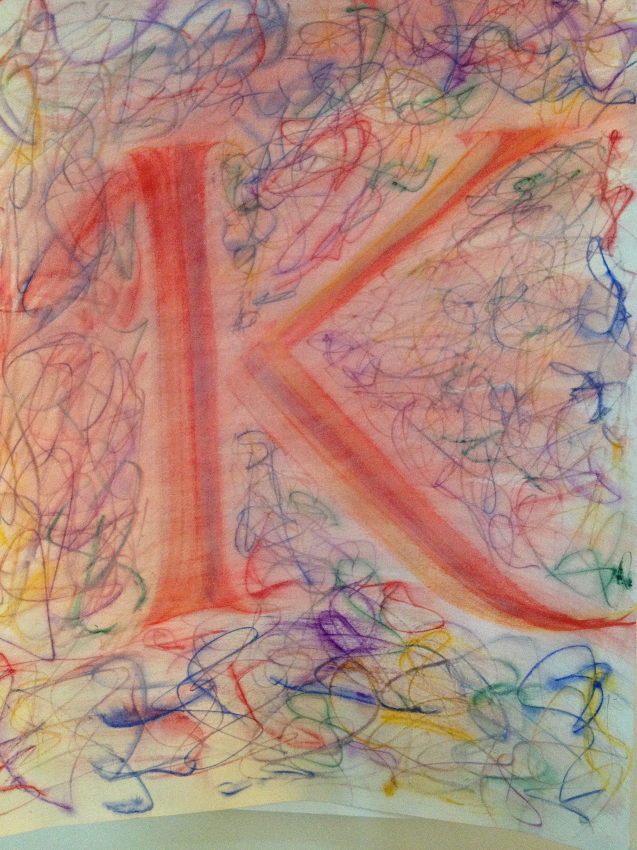
Some of these letters are nothing more than sketches. But they show that I can make big letters.

I know, it doesn’t seem like much – making a big letter shouldn’t be any more difficult than making a small one. But changing the dimensions this much creates challenges. Challenges that I didn’t think I could overcome.

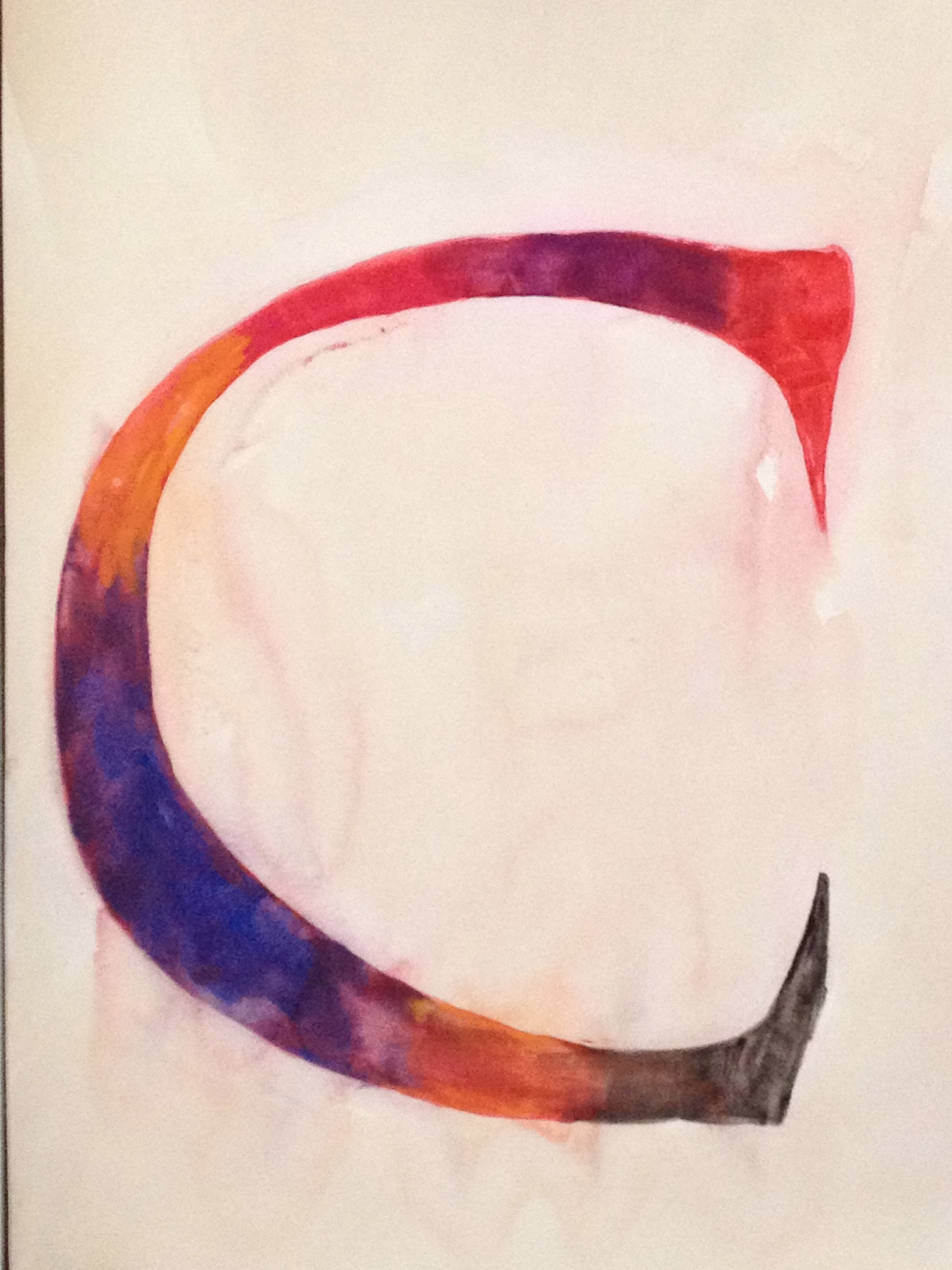
The S below is about 17″ tall. I did this last year but felt like it was a little rough – doing the color washes was not all that satisfying because so much area had to be covered and painted in while wet. Technical limitations aside, I  wasn’t happy with the image when seen on the wall.

Big Ol' S 17" on Bodleian hand made paper

Below is the B that I use as the thumbnail for this blog. It is about 2.5″ tall – maybe 3″ and was done quite easily with a brush.

2.5" B in Alphabet Book

2.5″ B in Alphabet Book

Ok, so that’s a little about technique but why make these letters instead of words?

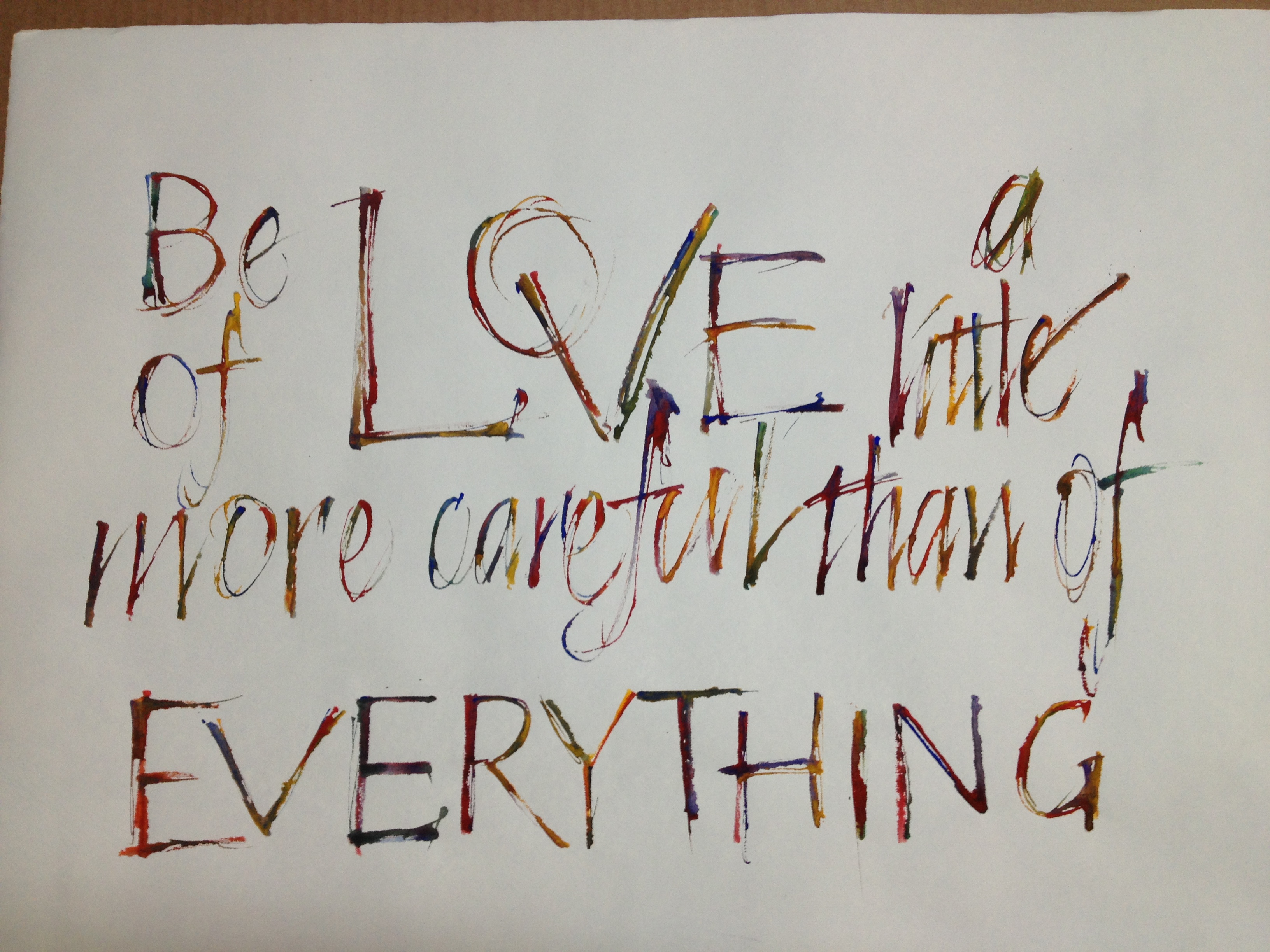
I like to make words with my letters. Last night I did a word piece because it seemed like I should have an example of that.

Be Of Love - April 2013 21" X 26"

Be Of Love – April 2013 21″ X 26″

I’m not much for life drawing though I’ve done a bit of it. I decided to do a self-portrait in the style of Giacometti – but with my tools and colors.

Self Portrait April 2013

Self Portrait April 2013

IMG_1071

I didn’t really capture my own visage, but I think I got a bit of feeling in it.

My quest is to portray each letter as if it had a personality of its own.

Painting these large letters are far more revealing than representational painting because I have been involved with letters in one form or another for about 40 years. I’ve done traditional calligraphy, typography, typesetting, graphic design, woodblock and letterpress printing. There’s always letters involved. Even if I do a woodblock image of something, there’s likely to be a letter or two in there.

This portrait series is an attempt to focus on the personality of my letters.

Or my personality through my letters.

Ward Dunham – bamboo cutting by the ocean

Image

Ward Dunham has been practicing calligraphy since the mid Sixties. He started in Viet Nam, and then went to NYC to work as a scribe… and bouncer. Ward’s abilities are many, but I’ll keep my comments to his scribal skills. Ward keeps his knives sharp and wields them with skill. In the video below, you’ll see Ward turn bamboo stalks into writing instruments. I have a lot to say about Ward, but I’m going to keep this brief today. Ward will be teaching how to cut bamboo pens in the future at BiblioForge.

We have postponed the March 2nd workshop until later this Spring. Once you’ve seen Ward, you’ll want to sign up for his class and learn how to make a reed into a pen.


Luca Barcellona – Graffiti Artist & Lettering Maestro

Luca Barcellona – Graffiti Artist & Lettering Maestro

If you are:
1) Enthralled with letters, graphic design or graffiti and

2) Free on Tuesday – and in the Bay Area

Come to the San Francisco Public Library at around 5:30 to meet Luca Barcellona. At 6:30, this 34 year old Milanese will talk about his work – from graffiti artist to calligrapher and graphic designer. His client list includes Carhartt and Dolce&Gabbana and his range is from street art to fine art.

Here’s a short video of Luca making a few letters:

Brush Letters

I am fascinated with brush lettering, though I’ve done very little of it. Luca combines the freedom of a street artist with the mastery of a type designer/calligrapher. I’ll talk with him at the library – and if I can get a good chat with him, I’ll write about it here.

UPDATE: Luca spoke to a full house and completely wowed the crowd. He was swamped with fans as the library closed up and sent us out into the night. So, unfortunately no talk.


BiblioForge.biz begins

National guillotine

This very nice tabletop guillotine took up residence in West Oakland at BiblioForge just yesterday, January 17, 2013 – on Art’s Birthday! Thanks to encouragement from friends like Jennie Hinchcliff, I am realizing a goal I’ve had for a while. Workshop space where books/art are made and classes are taught.

Bookbinding, calligraphy, letterpress, printmaking, papermaking and good ol’ art have long been avocations, professions and passions of mine; and now living in W. Oakland I am embarking on this new effort.

I trained as a scribe, binder, conservator and librarian. I continue to study binding structure and design by looking at books in collections throughout the US. Making books that work well and last while looking good is the focus of my design mindset.

Tomorrow is the first class – The Medieval Pocketbook. Where else are you going to be able to make a wooden-board book in one day? Nowhere but West Oakland! 😉


Metal+patches+2-1112872445-O

I made this book in 1992 and used it as my calendar for 1993, putting it in my back pocket and sitting on it, pulling it out to use many times a day. The back cover snapped, so I made a silver panel repair. Then I added the rectangle of nickle silver in the upper right. When the wood cracked near the leather, I put that patch in. Near the ned of the year, the outer corner of the wood broke and I tried to repair it with the brass patch at the top. That didn’t work and I lost the little corner piece. By the time I retired the book that year, it had shown its scars and wear patterns quite well. This is the type of book that we’ll make in the class.

I’m starting off slowly, with this as my first class. I’ve lined up teachers with varied backgrounds as a means of expanding the offerings. Jennie Hinchcliff, Ward Dunham, Jody Alexander, Tom Conroy and Patricia Wakida have committed to classes this spring. In another post I’ll list the schedule for those upcoming classes, and I think it’ll be a lot of fun for students and teachers alike.

In addition to classes, I will be writing about books, history, art and maybe even motorcycles.