Familial diversity

Image

Letters – in the world of calligraphy and type – come in families. There should be a resemblance to the one next to it because legibility is measured by the repetition of similar patterns and shapes. When a letter doesn’t resemble one next to it, reading comprehension is lowered – it takes longer for the eye to recognize the negative shape of one letter if it isn’t in the family of its surrounding forms.

I’m not trying to make a family of letters to be put together to make words flow together, easily read.

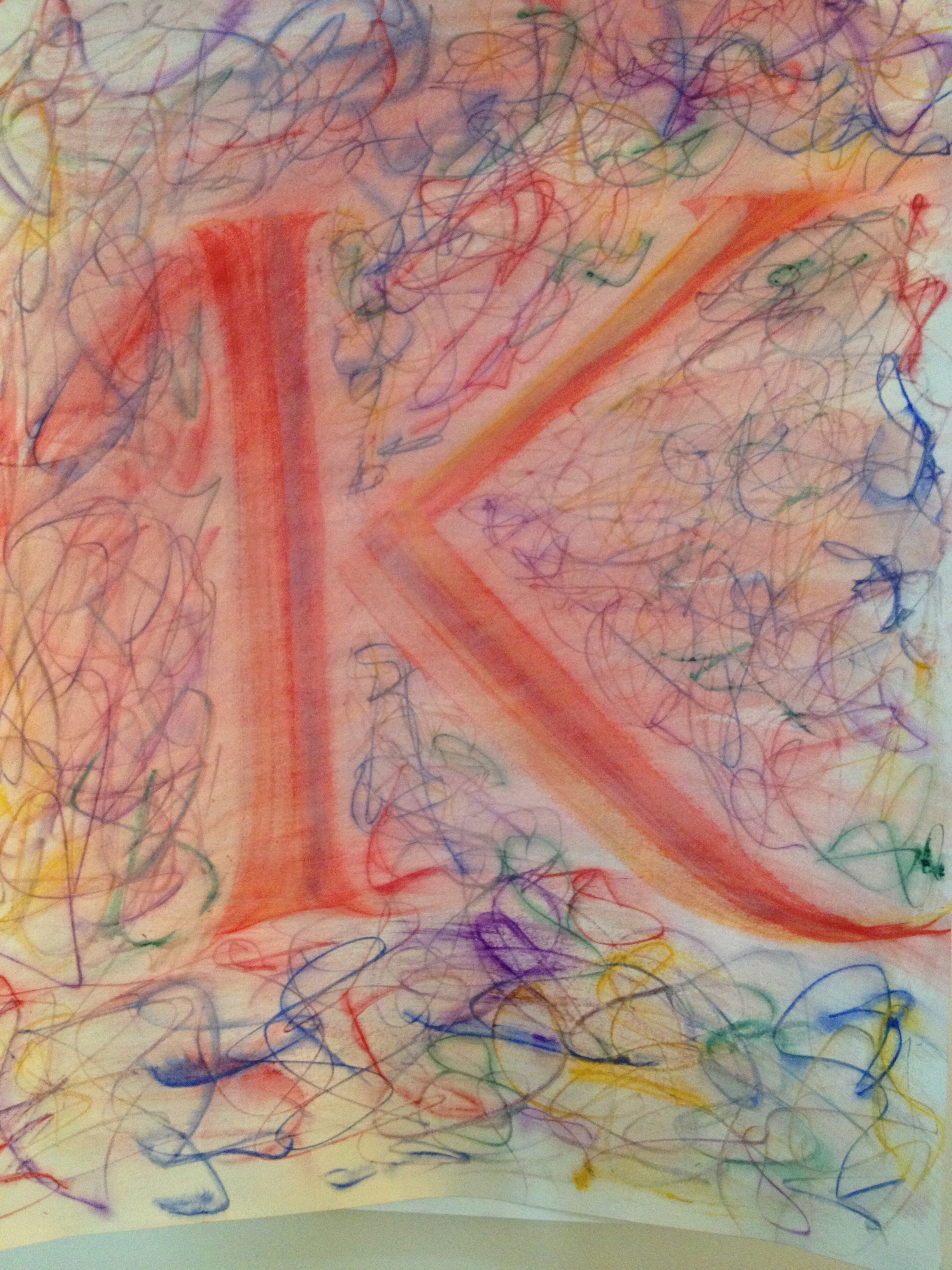
My exercise has been to focus on each letter as if it were independent of its day job. These letters stand (mostly) alone in their finest or most outrageous garb.

Image

Maybe they’re a little skittish, or excited or they might be understated and simple.

Image

I come to the page and watch them develop in front of my eyes, like a dresser that is guided to do their bidding.

IMG_1312

IMG_1309

LETTERS: Writ Large!

Image

This coming Friday, June 7, 2013 I will be in a group show in Oakland, CA. I’m calling my part of it “LETTERS: Writ Large!”

This is the first show in which I’ve had work in a long time and I’ve been painting & lettering quite a bit in the past month. You saw the beginnings in my last post and I’ve added a number of pieces to the  pile. I’ve gotten more comfortable and confident at working large and am getting to enjoy the process. 

The show will give me a chance to see what all these letters look like spread out in a big space. 

Breaking the component parts of language back down to letters – and exploring how to paint a letter have been interesting. Getting past my internal letterform editor and allowing the letters to be and become formed as they are was tough.

Image

I found that if the shape of the letter wasn’t what I had in mind, then I presumed it was not any good. But friends that have seen them have found things in these imperfect letters that I didn’t see at first. The bowl of the P above is greater than a Trajan P would be. And I had a Trajan P in mind when I made it, so this is a failure. From that ideal.

The letter comes alive and its imperfection becomes an aspect of its personality. 

Image

Styles and techniques got thrown together and pulled apart. Using tools in ways I hadn’t used them before makes for some fun discoveries and forces a looseness that is counter to my training.

I’ve got more to say, but for now, I’ll leave you with a Tessellated T

Image