Make Your Mark @The Compound Gallery

IMG_1885

Are you afflicted with kinesthetic connection? Do you still like to write or draw with a pen or brush on paper? Do you get an oxytocin hit from feeling the feedback of the paper through your mark-making tool?

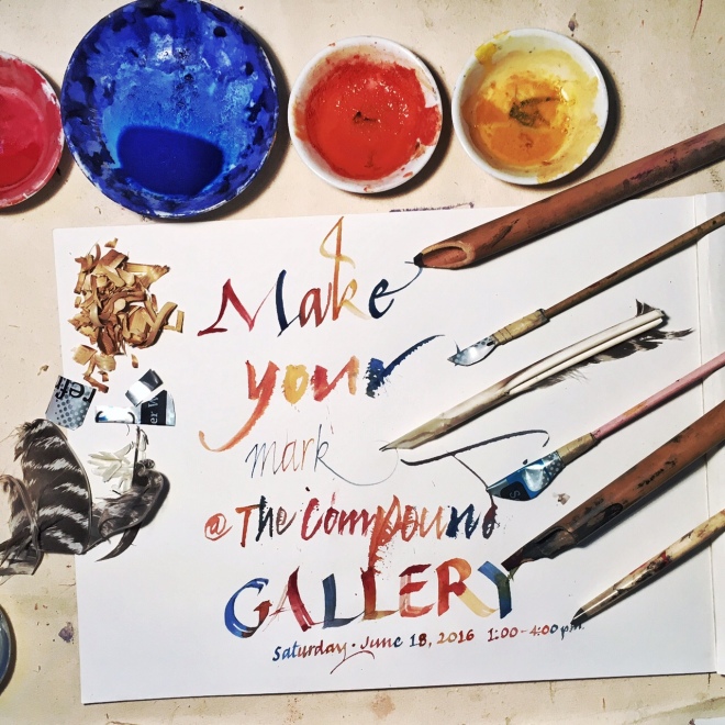
We have help for you. The only cure is to get closer to that connection. Make Your Mark gives you the means of making your own writing, drawing, painting tools. In three hours you’ll learn to make a quill pen, a reed pen and a soda-can folded pen (modified ruling pen). You’ll also get the chance to play with these tools with different paper and media – ink, gouache or watercolor.

Once you know the ancient (anything older than last year is ancient, right?) ways of making your own tools, you’ll have the means to connect even more with your work.

Make Your Mark workshop at The Compound Gallery
1167 65th st. Oakland, CA 94608
Saturday, June 18, 2016. 1:00 – 4:00 p.m.
$33 workshop + $7 materials = $40
Feathers and bamboo sticks if you want to bring them.

Negative shapes

Stained C Gouache on paper

Stained C
Gouache on paper

The positive defines the negative – that is how letters work. Manipulating that relationship never gets old for me. This big ol’ C was fairly simply and directly made – a few colors painted and blended on a large sheet of paper. It got a little interesting when I sprayed water on the painted surface and let it bleed. There’s a three-dimensional quality that comes about in the staining that is far greater than on the paper itself.

A 12" square S made with acrylic paint

A 12″ square S made with acrylic paint

After talking with a few artists, I decided to move up to paint. Starting with an “open” acrylic, I gave it a try on a manufactured gessoed 12″ wooden panel. I was surprised at how easy it was to work with the color and how well it responded to watercolor technique.

B drippin'

B drippin’

And this one – where the negative becomes positive, leaving the B shape as the background. With a little staining, once again. For some reason color bleeding into the white space attracts me.

Familial diversity

Image

Letters – in the world of calligraphy and type – come in families. There should be a resemblance to the one next to it because legibility is measured by the repetition of similar patterns and shapes. When a letter doesn’t resemble one next to it, reading comprehension is lowered – it takes longer for the eye to recognize the negative shape of one letter if it isn’t in the family of its surrounding forms.

I’m not trying to make a family of letters to be put together to make words flow together, easily read.

My exercise has been to focus on each letter as if it were independent of its day job. These letters stand (mostly) alone in their finest or most outrageous garb.

Image

Maybe they’re a little skittish, or excited or they might be understated and simple.

Image

I come to the page and watch them develop in front of my eyes, like a dresser that is guided to do their bidding.

IMG_1312

IMG_1309