I met Mark Donham in 2008, as part of an online motorcycle community called ADVrider.com. Mark lives outside of Portland and is a very accomplished rider and traveler. His wife, Chris suffered from early-onset Alzheimer’s and he quit his job to care for her in her final years. After that, he decided to take a ride around the world. The idea was to experience travel on a motorcycle after the challenge of caring for Chris. Mark documented his trip that is just wrapping up here.
Mark stayed with me on a couple of trips south and north when I lived in Penngrove at the Bank Ranch, and I stayed with him in Portland when I rode up to the Pacific Northwest in 2009. He chose to visit me on his way back to Portland after landing in LA and getting on his bike to ride home.

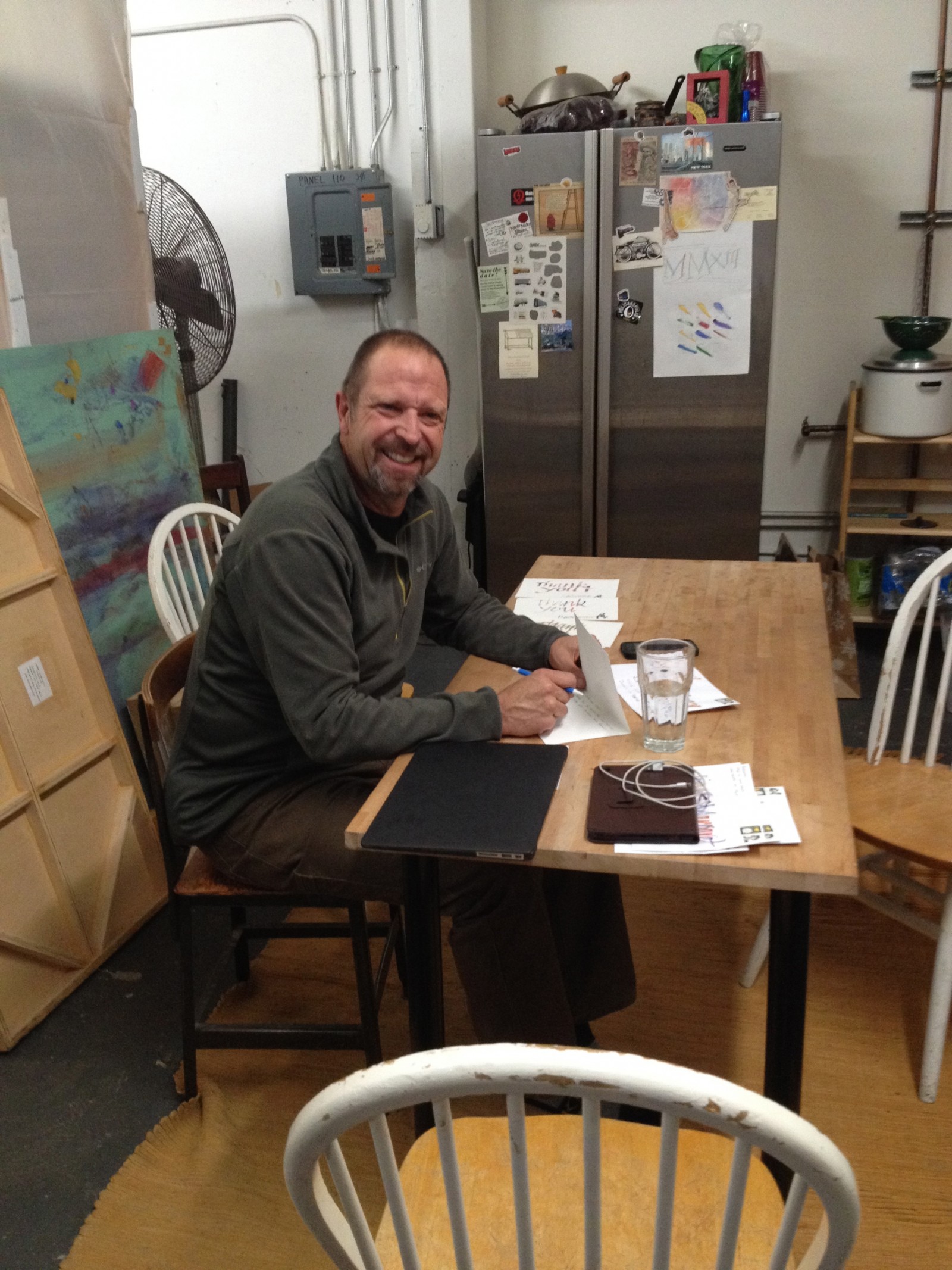
Mark going all analog on his social obligations
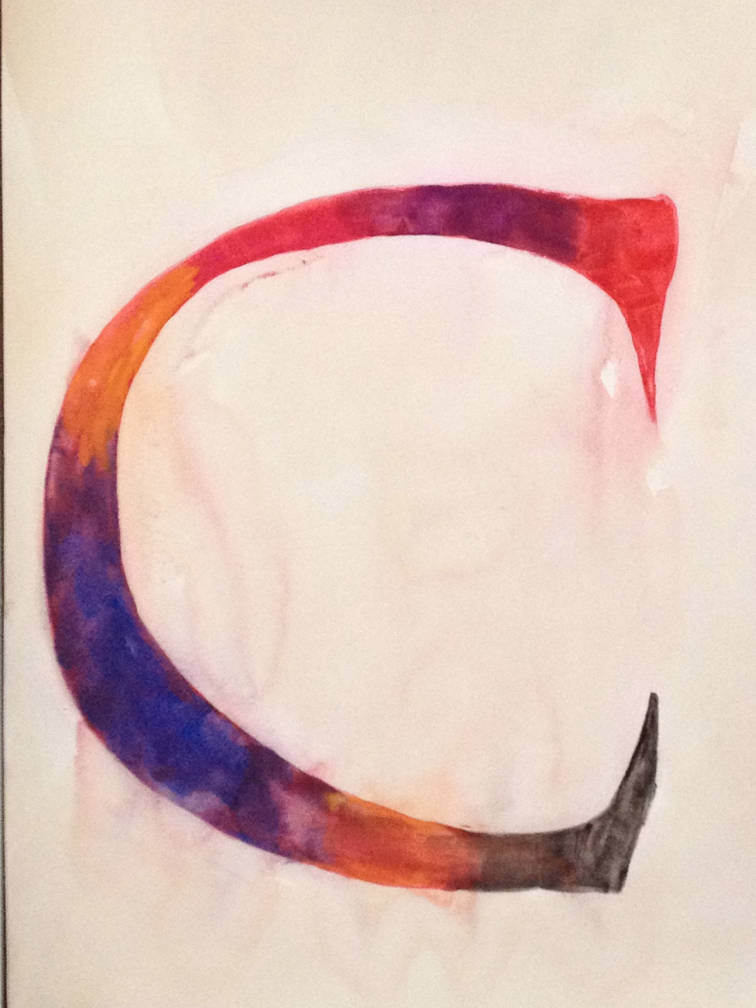
This morning Mark mentioned that he’d like to get some cards to send to friends that hosted him on his trip. Having just spent time in South Africa, he wanted to send thank you cards. I offered to make him a few custom ones, so we worked most of the afternoon on coming up with a few custom cards that he could send his hosts in South Africa, LA and along the way up the coast.

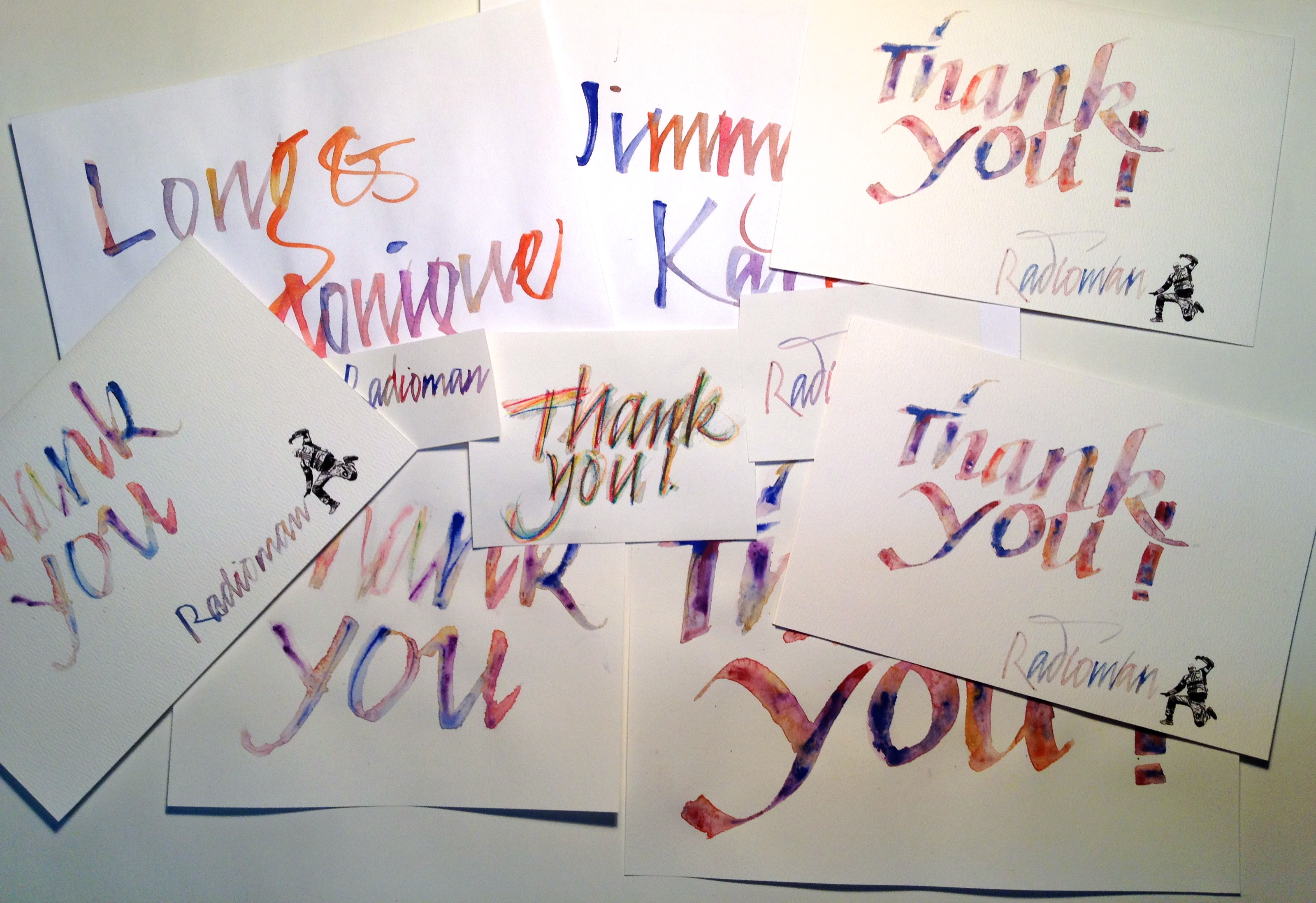
Original artwork for custom cards.
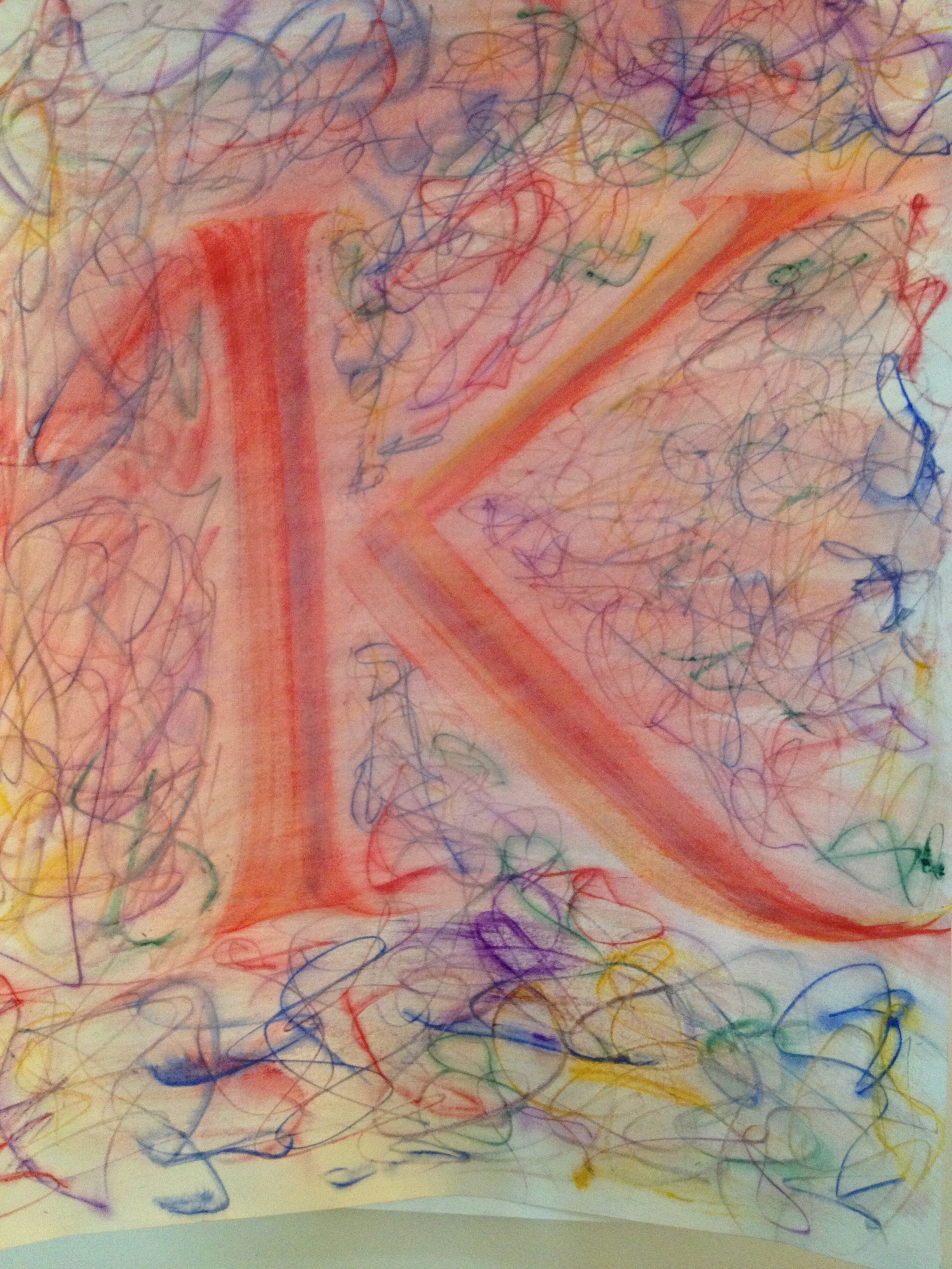
Mark is a very talented guy and has a good aesthetic sense, but isn’t skilled at creating visual art. So I wrote out a few versions of the simple message of Thank You and he reviewed them and then picked three.
On his trip, he would do this fun jump and set up his camera and do a self-portrait of his jumping for joy. Mark took one of those pictures, scaled it down and then used a filter on it to make it read well in black and white. He then scanned my artwork and came up with three different cards.

Thank You – variations on a theme
It was a great way to spend the day because we talked about his trip, his future, art and what’s important about life.

I’m glad I got to contribute to Mark’s trip by adding a calligraphic touch.
Mark, thanks for letting me spill a little ink on your trip!