Ruling Pen Workshop

Workshop Flyer Written WIth Ruling Pens

Workshop Flyer Written WIth Ruling Pens

How to Write with a Ruling Pen on Vimeo

Click link above for a short video

I’ll be teaching a workshop on how to use a fun calligraphy tool – the Ruling Pen. For the last 80 years, scribes have been using this “new” writing instrument to express themselves by making letters that break away from the broad edge pens of past scribes.

The pen makes its mark by being pulled and the ink is dragged out of the side of the instrument. One can vary width by what part of the instrument is being dragged across the surface – sideways. Using the pointed tip gives the scribe the chance to make small, fine letters. Working with the side of the tool, greater width strokes are possible.

Because the color is pulled out the side, there is greater inconsistency to the edge of the letterform. Add a rough-textured paper and the result is an even coarser edge. Often, splatters appear on the paper as the color is flung out when the pen is drawn across the uneven surface.

All skill levels can take this workshop. 

This workshop will teach how to use the tool, adding color and working it to greatest advantage. Students can use their own handwriting or modify calligraphic hands that they’ve learned.

The workshop is $60 for four hours of instruction and practice. The $10 fee supplies paper, ink and gouache colors to use in creating your written art. We will experiment with different papers to understand how to exploit the tool’s unique mark-making characteristics.

Ruling Pen Workshop  – Sunday, October 27, 2013
1:00  –  5:00 pm $60 +  $10 materials fee (paid at workshop)

Negative shapes

Stained C Gouache on paper

Stained C
Gouache on paper

The positive defines the negative – that is how letters work. Manipulating that relationship never gets old for me. This big ol’ C was fairly simply and directly made – a few colors painted and blended on a large sheet of paper. It got a little interesting when I sprayed water on the painted surface and let it bleed. There’s a three-dimensional quality that comes about in the staining that is far greater than on the paper itself.

A 12" square S made with acrylic paint

A 12″ square S made with acrylic paint

After talking with a few artists, I decided to move up to paint. Starting with an “open” acrylic, I gave it a try on a manufactured gessoed 12″ wooden panel. I was surprised at how easy it was to work with the color and how well it responded to watercolor technique.

B drippin'

B drippin’

And this one – where the negative becomes positive, leaving the B shape as the background. With a little staining, once again. For some reason color bleeding into the white space attracts me.

Familial diversity

Image

Letters – in the world of calligraphy and type – come in families. There should be a resemblance to the one next to it because legibility is measured by the repetition of similar patterns and shapes. When a letter doesn’t resemble one next to it, reading comprehension is lowered – it takes longer for the eye to recognize the negative shape of one letter if it isn’t in the family of its surrounding forms.

I’m not trying to make a family of letters to be put together to make words flow together, easily read.

My exercise has been to focus on each letter as if it were independent of its day job. These letters stand (mostly) alone in their finest or most outrageous garb.

Image

Maybe they’re a little skittish, or excited or they might be understated and simple.

Image

I come to the page and watch them develop in front of my eyes, like a dresser that is guided to do their bidding.

IMG_1312

IMG_1309

LETTERS: Writ Large!

Image

This coming Friday, June 7, 2013 I will be in a group show in Oakland, CA. I’m calling my part of it “LETTERS: Writ Large!”

This is the first show in which I’ve had work in a long time and I’ve been painting & lettering quite a bit in the past month. You saw the beginnings in my last post and I’ve added a number of pieces to the  pile. I’ve gotten more comfortable and confident at working large and am getting to enjoy the process. 

The show will give me a chance to see what all these letters look like spread out in a big space. 

Breaking the component parts of language back down to letters – and exploring how to paint a letter have been interesting. Getting past my internal letterform editor and allowing the letters to be and become formed as they are was tough.

Image

I found that if the shape of the letter wasn’t what I had in mind, then I presumed it was not any good. But friends that have seen them have found things in these imperfect letters that I didn’t see at first. The bowl of the P above is greater than a Trajan P would be. And I had a Trajan P in mind when I made it, so this is a failure. From that ideal.

The letter comes alive and its imperfection becomes an aspect of its personality. 

Image

Styles and techniques got thrown together and pulled apart. Using tools in ways I hadn’t used them before makes for some fun discoveries and forces a looseness that is counter to my training.

I’ve got more to say, but for now, I’ll leave you with a Tessellated T

Image

Observations On The Process Of Making Letters

15" Q ruling pen & gouache

15″ Q ruling pen & gouache

I have been suffering a 2 month long excema bout that has left me in quite a bit of pain and unwilling/able to write or do much of anything. It appears to be on the wane, so I can return to more pleasurable pursuits like writing.

Letters, that is. 😉

Pointy A

Pointy A

I have been wanting to make a portrait letter series since the millenium – thirteen years is a long time for an idea as simple as this to come together.

At the beginning I wanted to make 26 parchment surfaces because I have made vellum and wanted to get back to it. Some people make their own paper for their art, I wanted to make my own parchment. That was the first hang-up, and a good one because it masked my fear.

And my fear was that I can’t make large letters all alone and have them look interesting.

15" O

Some of these letters are nothing more than sketches. But they show that I can make big letters.

I know, it doesn’t seem like much – making a big letter shouldn’t be any more difficult than making a small one. But changing the dimensions this much creates challenges. Challenges that I didn’t think I could overcome.

The S below is about 17″ tall. I did this last year but felt like it was a little rough – doing the color washes was not all that satisfying because so much area had to be covered and painted in while wet. Technical limitations aside, I  wasn’t happy with the image when seen on the wall.

Big Ol' S 17" on Bodleian hand made paper

Below is the B that I use as the thumbnail for this blog. It is about 2.5″ tall – maybe 3″ and was done quite easily with a brush.

2.5" B in Alphabet Book

2.5″ B in Alphabet Book

Ok, so that’s a little about technique but why make these letters instead of words?

I like to make words with my letters. Last night I did a word piece because it seemed like I should have an example of that.

Be Of Love - April 2013 21" X 26"

Be Of Love – April 2013 21″ X 26″

I’m not much for life drawing though I’ve done a bit of it. I decided to do a self-portrait in the style of Giacometti – but with my tools and colors.

Self Portrait April 2013

Self Portrait April 2013

IMG_1071

I didn’t really capture my own visage, but I think I got a bit of feeling in it.

My quest is to portray each letter as if it had a personality of its own.

Painting these large letters are far more revealing than representational painting because I have been involved with letters in one form or another for about 40 years. I’ve done traditional calligraphy, typography, typesetting, graphic design, woodblock and letterpress printing. There’s always letters involved. Even if I do a woodblock image of something, there’s likely to be a letter or two in there.

This portrait series is an attempt to focus on the personality of my letters.

Or my personality through my letters.

Jennie Hinchcliff & Jody Alexander classes – seats still available

We’re into the late winter days of a harsh California winter. Oh wait, that’s an oxymoron, isn’t it? 😉

Nonetheless, here it is the second weekend of March, and you’re probably wondering how you can spend the late winter weekends productively. BiblioForge has the answer – twice!

First, Jennie Hinchcliff will get your fingers happily working with a caterpillar stitched book that is a lot of fun to make – and has a lot of great design ideas! Sign up today!

And Jody Alexander has a really cool and elegant Cross Stitch Binding class that gives you a versatile paper case binding. Get creative! This is a favorite at Jody’s Wishi Washi Studio in Santa Cruz and at the SF Center for the Book.


hinchcliff_caterpillar_06

Jennie Hinchcliff – Creative Caterpillar Binding Class – March 23, 2013

10:00 am – 5:00 pm

With plenty of possibility for exploration and a wonderfully tactile feel, the “caterpillar” method of book construction is attention grabbing, to say the least! Credited to Betsy Palmer Eldridge, the Caterpillar Binding can be used for artists’ book projects, sketchbooks, or any other sewing method where dimensional binding would be a welcome addition.

In this intermediate level class, students construct 1-2 softcover books of their own design (as time allows), in addition to exploring different methods of cover attachment. Experience with sewing basic text blocks is preferred.
Materials and supplies (students): X-acto knife with extra blades, bone folder, pencil, right angle triangle (small or medium size is o.k.), inexpensive small, flat bristle brushes for glue-ing, a pair of full size, sharp scissors, bookbinder’s awl or an icepick, any additional papers/ephemera that might be used
as decoration for book covers (photos/collage elements/etc.)

Instructor provides: instructional handouts, decorative papers for book covers, waxed linen thread, needles, a limited selection of art tools and supplies such as colored pencils, rubber stamps, inkpads, acrylics, PVA glue, newsprint.

$120 +  $20 materials fee (paid at workshop)

Jennie Hinchcliff currently teaches book arts classes in Fine Art Department at the Academy of Art University, as well as numerous workshops nationally and locally. You can follow her postal adventures at: http://redletterdayzine.wordpress.com/ 


crossed-structure

Jody Alexander – Cross Stitch Structure – April 6, 2013
10:00 am – 1:00 pm

The Crossed Structure binding is a contemporary paper case binding with historical accents.  We will be using flax paper made by Cave Paper for the cover that also acts as the binding’s support. Stitching is used to fasten down the supports that can be both functional and decorative. This is a sturdy binding that is perfect for a journal or datebook. Great binding for beginners and advanced, alike. Can be easily re-created in a home studio with simple hand tools.

$80 + $5.00 materials fee (paid at workshop)

Jody Alexander is an artist, bookmaker, papermaker, librarian and teacher who lives and works in Santa Cruz, California.  She creates books, sculptural pieces and installations that celebrate collecting, storytelling and odd characters. Her work appears in a number of publications including Masters: Book Arts: Major Works by Leading Artsist500 Handmade Books, and the recently published 1000 Artists’ Books: Exploring the Book as Art. She has recently opened Wishi Washi Studio -her own teaching space at the Tannery Arts Center in Santa Cruz, California.


Interview with Jennie Hinchcliff; proprietoress of redletterdayzine blog

Jennie Hinchcliff will be teaching two classes:

Structures With Style: Secret Belgian Binding Class – March 9, 2013
10:00 am – 5:00 pm$120 + 20 materials fee (must bring to class)

hinchcliff_belgian_02           hinchcliff_belgian_03


hinchcliff_belgian_05


Creative Caterpillar Binding Class – March 23, 2013
10:00 am – 5:00 pm $120 + 20 materials fee (must bring to class)

hinchcliff_caterpillar_06      hinchcliff_caterpillar_02

Jennie’s a lot of fun & is a talented ball of fire. I had the pleasure of working with her when I taught at the SFCB and then when we were on the board of the Pacific Center For Book Arts. I keep thinking up things to do with her because she’s always got a great attitude and comes up with great ideas and projects.

I wrote Jennie a few questions that seemed pertinent to let students know what kind of teacher they would encounter in these great classes. Of course, I wanted to be serious. 

Why are you a book artist/postal modern, instead of the ruler of the free world?
“Ruler of the Free World” is a great title to put on the ol’ CV, but it seems like a straight up 9-5 job…I’m pretty attached to keeping my own hours.

Did you ever think you’d be making a living by making art?
I can’t imagine how else I’d be making a living, to tell you the truth.

What is it about mail-art that fascinates and enthralls you? 
I love the whole philosophy of mail art: anyone can take part, that it can be as simple or as complicated as one wants and people exchange with each other because they want to — not out of obligation.  Mail art goes far beyond being passionate about the USPS, although that definitely plays a part. The artists and letter writers I’ve met through the mail art Network are incredibly creative; I feel so fortunate to correspond with the likes of Cascadia ArtPostJohn Held, Jr., Reed AltemusSally Wurlitzer…there are too many to name, all truly talented artists. Every time I stop by my PO box, it’s like Christmas and my birthday all rolled into one. Mail artists have a saying, that “the mailbox is a museum” and it’s oh-so-true.

When did you know that making books and doing mail-art wasn’t just a passing fancy?
I’ve always made things with my hands; as a kid I would make little books and fill them with goofy stories. My grandmother and I would make origami animals or glue up collages — things like that. I was first introduced to mail art when I checked out the book “SWAK: The Complete Book of Mail Fun for Kids” by Randy Harelson from my grade school library; as a fifth grader, I couldn’t believe that there was a community of people who sent wacky things to each other through the mail. Because things like paper, postage, and books are so much a part of who I am, I never considered them as passing fancies.

What is your five-year plan for changing the world through your artistic endeavors? 
Well, I can neither confirm nor deny that my five year plan is currently in effect. But I can tell readers of the Biblioforge blog that the plan-which-shall-not-be-named will involve plenty of stamps (postage AND rubber!), lots of postcards, and a workshop or three. There might even be an artist book series and a postmaster thrown in for good measure.

Will you show mercy on the congressional ogres that keep undermining the good in the USPS once you’ve taken control?
(Taking a deep breath, stepping away from the soapbox) I think that every lawmaker who has had a hand in decimating the USPS should have their Saturday delivery service taken away and their free mailing/postal privileges revoked. This would be a step in the right direction towards awareness of how important the USPS is to individuals, as well as the country. Fact: the current USPS vs. the US government situation is confusing, but anyone who uses the postal system should understand the basics of how this happened. And then, I would invite Biblioforge readers to sign the “The Post Office Isn’t Broke, It’s Being Robbed” petition.

Final thoughts?
I’m looking forward to teaching at Biblioforge in March! Workshops are one of my favorite ways to meet new folks who are enthusiastic about making books. I love skill sharing with students, seeing that “aha!” moment occur when someone “gets it” as far as learning a new book structure is concerned. After all, there’s no substitute for holding a “real” book in your hands: turning the pages at your own pace, feeling the paper. And if you’ve made that book yourself? Well, there’s truly nothing like it.

Jennie Hinchcliff currently teaches book arts classes in Fine Art Department at the Academy of Art University, as well as numerous workshops nationally and locally. You can follow her postal adventures at: http://redletterdayzine.wordpress.com/ 


Ward Dunham – bamboo cutting by the ocean

Image

Ward Dunham has been practicing calligraphy since the mid Sixties. He started in Viet Nam, and then went to NYC to work as a scribe… and bouncer. Ward’s abilities are many, but I’ll keep my comments to his scribal skills. Ward keeps his knives sharp and wields them with skill. In the video below, you’ll see Ward turn bamboo stalks into writing instruments. I have a lot to say about Ward, but I’m going to keep this brief today. Ward will be teaching how to cut bamboo pens in the future at BiblioForge.

We have postponed the March 2nd workshop until later this Spring. Once you’ve seen Ward, you’ll want to sign up for his class and learn how to make a reed into a pen.


Tom Conroy, Tricky Binder

Last week, I went back to the Robbins Collection again to gather more information – and take a few pix. If they give me permission to use them, I’ll write about what I found. 
Image
I had a couple of articles borrowed from Tom Conroy, so I had to return them and had the opportunity for another visit. We started talking about a class that I plan to teach on how to look at books for book artists/craftspeople. We’ll visit a handful of rare book collections in the Bay Area, focusing on a different subject at each institution. Wooden boards & early manuscripts at the Robbins; Incunables somewhere else; and maybe a calligraphic history section at a private collection. 

Image

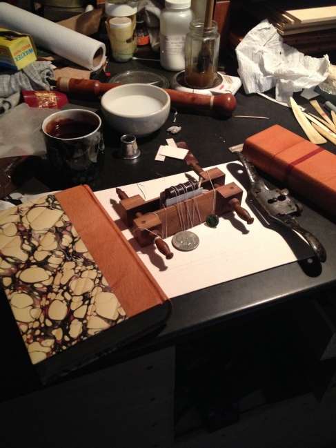
While we talked, Tom moved around and laid things out – he’s still working on that miniature bible and had covered it in leather. He tied it up in the miniature press and was taking pictures as we spoke.

Drawing my attention away from his main object, Tom asked a few questions about my class: How was it structured? How many institutions? Who would be attending?

As this barrage of questions pelted me, Tom kept on moving and waited as he set the trap. 

And I fell right in: “Hey Tom, do you want to team teach this with me?”

He smiled that private smile of his and that is when I knew I’d walked right into it.

So now this class will be a lot more fun and informative because I was duped into adding him to the line-up.

As you can see, I’m really upset by this development. 😉

We were also talking about how the eye becomes trained to see little things and sense their significance. I had seen an incunable with an alum-tawed spine. No portion of the boards was showing, just the spine which had a part of the skin peeled away from the joint at the top. I could see some dark-colored corner exposed by the detached skin, but that was all. 

I pulled it out and it was a wooden-board binding. I didn’t know what I would find.

Because I took the chance of pulling this book off the shelf, I was rewarded with finding an example I would have missed otherwise. 

Image 
 
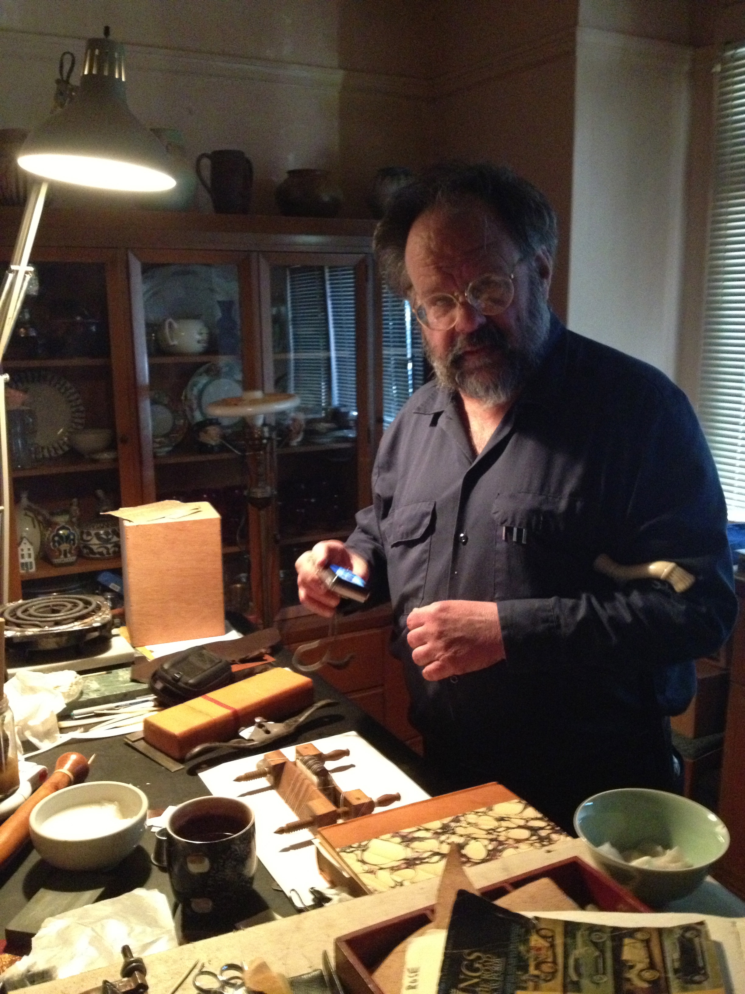
Tom pointed to the plane in the center of the picture you see above. He was offered a box stuffed with musty bits in exchange for helping a friend clear up a storage area. He saw about 1/2″ of the top of the handle and knew that it was a pre-war Stanley plane – and that it was worth having. 

Developing an eye for things is something that comes with experience. And that’s what we want to teach in our codicology for book artists class.

Having learned by looking at a large quantity of books, tools and objects, it’s easier to pick up things quickly. I used to be amazed at how my teachers could do this pattern recognition with just a quick glance – and I thought I’d never get it.

Now, it’s second-nature.

In my previous visit, Tom was putting linseed oil on a handle that he had turned. He kept rubbing the oil into the wood – it had soaked for some time – maybe a week? He then prepped the hole at the end of the handle and took a stout sewing needle and pushed it down the hole. Wood glue and a lot of manipulation later, the needle was firmly seated in the handle. And he handed it to me to look at.

Or so I thought. He gave it to me for my own use.

I’ll get a picture of it for the next post about Tom.

Image

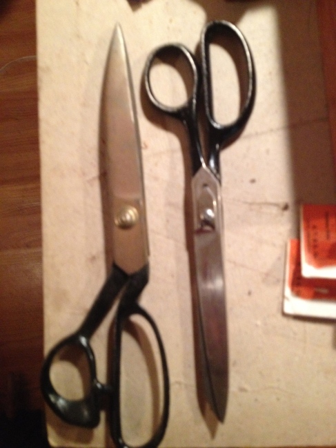
The last little trick was to show me a pair of scissors as we discussed the subject of seeing things at a glance. Tom’s gifted at finding good pairs of scissors and shears at flea markets. His skill is such that he has amassed a quantity far greater than he can ever use. I suggested he sell them, and he said that was a good idea.

I asked the cost of the pair in my hand – the one on the right above – he told me that I could have them for $10.

So I bought them. And he thanked me for saving him the hassle of cleaning and sharpening them.


See? He’s a tricky binder!

Luca Barcellona – Graffiti Artist & Lettering Maestro

Luca Barcellona – Graffiti Artist & Lettering Maestro

If you are:
1) Enthralled with letters, graphic design or graffiti and

2) Free on Tuesday – and in the Bay Area

Come to the San Francisco Public Library at around 5:30 to meet Luca Barcellona. At 6:30, this 34 year old Milanese will talk about his work – from graffiti artist to calligrapher and graphic designer. His client list includes Carhartt and Dolce&Gabbana and his range is from street art to fine art.

Here’s a short video of Luca making a few letters:

Brush Letters

I am fascinated with brush lettering, though I’ve done very little of it. Luca combines the freedom of a street artist with the mastery of a type designer/calligrapher. I’ll talk with him at the library – and if I can get a good chat with him, I’ll write about it here.

UPDATE: Luca spoke to a full house and completely wowed the crowd. He was swamped with fans as the library closed up and sent us out into the night. So, unfortunately no talk.